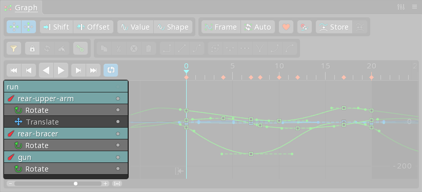
The visibility dot next to the overview row in the Graph view controls the visibility of all the curves in the graph. When you toggle this dot, it will show or hide all the curves for the currently visible timelines. This includes attachment timelines, which are typically just points in time without any vertical component, making them less interesting to visualize in the graph.
When you toggle the dot with nothing selected, it will show all the curves, including those for attachments. This can be useful for ensuring that all your keyframes are visible, but it can also lead to a cluttered view if there are many timelines. If you only want to show hidden curves without hiding any, you should be cautious with this toggle, as it affects all curves indiscriminately.
For your tutorial, you might want to emphasize that while the overview row's visibility dot is a powerful tool for quickly showing all curves, it should be used with an understanding of its broad impact. Users should be aware that it will affect attachment timelines as well, which might not always be desirable.
Here's a visual reference from the user guide to help illustrate this:

For more detailed control, users can toggle individual visibility dots for specific rows or use the Sync button in the Dopesheet view to manage what is displayed based on the Graph view.